West Midtown Remodel - Before and After
Before & After’s are the best and I have a GREAT one for you today. A few months ago I met a kitchen that needed a hug. A big one. Let me show you around the “before” so you have a good sense of what we had to work with here.


Busting at the seams is the best phrase to describe this kitchen. A lot of you can probably relate to this scene where every inch is being utilized, but there just aren’t enough inches to go around to achieve a truly organized, functional space. The homeowner’s had talked to several people before me and there had been several ideas tossed around, but nothing felt right. Like a lot of people, they knew they wanted to make the space better, but didn’t want to invest money into a project that would get them a prettier kitchen, but with the same functional shortcomings. After playing around with a bunch of options I came up with a plan that included taking down a wall, covering up a window and opening the kitchen up into the Living Room. It was bold, but I knew that making these changes would truly optimize the space and transform the look and feel of the entire first floor.
Removing the wall between the kitchen and the living room was the most crucial step.

As you can see the wall really closed off the kitchen from the rest of the first floor. By removing it we would be able to extend the kitchen length wise and incorporate an island! But not before we made another crucial change. We also needed to close up the window you see beyond the wall in the photo above. The window sat in a sort of “no-mans -land” between the kitchen wall and the living room. I’m honestly not sure what the intended use for this space was, but it was valuable real-estate so I wanted to grab it up for the kitchen. Now, I’m a window lover and natural light fanatic, but the truth is the first floor gets a lot of great natural light, so the absence of this one window wouldn’t make that much difference, if any, and what we would gain by losing it would be invaluable.
So, we had a plan, but before any cabinets were constructed or appliances ordered, we needed to get the wall down to confirm if it was load bearing and to be able to take good, tight dimensions to base everything off of.

Turns out the wall WAS load bearing which was a bummer, but something we knew was a real possibility so we just planned accordingly by incorporating a support beam.
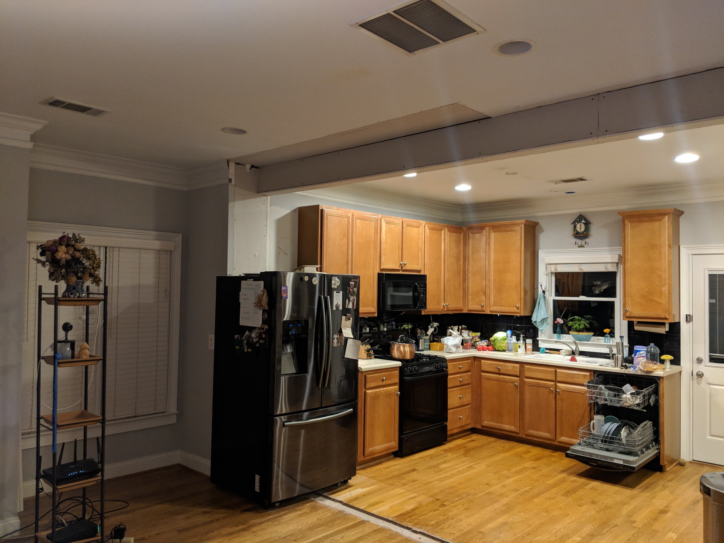
It’s crazy how much more open the space instantly felt with the wall down. A great sign for things to come! While we waited for cabinets to be constructed, electrical was added, appliances were purchased and we finalized all of the other selections - sink, faucet, countertops, hardware, lighting, etc.
As for the window, the plan was to wait until the cabinets were being installed to remove the trim and cover the window. Much like the window we covered in Croix’s big-boy room makeover last year, we didn’t touch the window from the outside. We simply removed the trim around the window on the inside and covered the window with plywood that was painted black. So, from the outside it just looks like the lights are out and from the inside, you would never know a window existed.
Next up, cabinets were installed and after that it was a snowball of finishing touches - countertops were templated and installed, backsplash tile went in, plumbing was hooked up, new hardwoods were laced in and refinished, lighting was installed and appliances were hooked up. It was a whirlwind, but it all came together and look what the space looks like today….

Photo: The Designery Photo Lab
Can you even believe it’s the same kitchen?
Not only is it pretty, but there is so much more storage! Beyond the addition of the 8 foot island we were able to incorporate a trash pullout, spice insert to organize spices, tray dividers and rollouts, not to mention the giant walk-in pantry that now sits where the window used to be.

Photo: The Designery Photo Lab
The microwave was relocated to the pantry and a true vent hood was incorporated. We went with quartz countertops and a beautiful marble backplash in a herringbone pattern. I love the depth of colors within the backsplash, it really pulls out the blue from the base cabinets and even the copper from the sink! The two-toned cabinetry is another favorite. Not only do I love the shade of blue but I like how keeping it only to the base cabinets really grounds the space.
Let’s do a side-by-side to truly celebrate how far this room has come:


Photo: The Designery Photo Lab
It’s just such a happy kitchen now and a beautiful center piece for their first floor. Even better? 13 days after we took these pictures their beautiful baby boy was born. Doesn’t get much better than that - new kitchen and a new baby! A happy year indeed! Oh and before you ask, yes - I do make it a practice to ensure my outfit matches my projects in photos…I mean, details people…:)